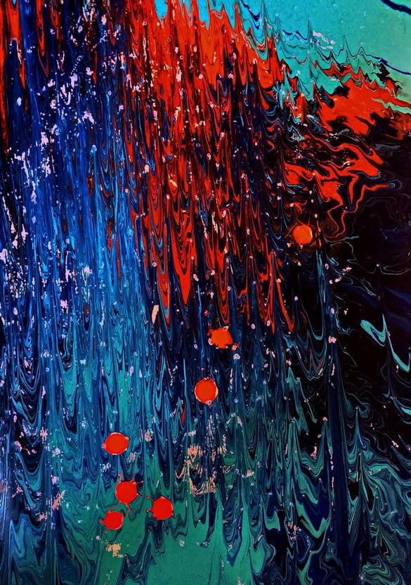
I’ve been trying to reduce the number of started paintings that have good potential, and this is one that I started at a summer workshop. The composition just didn’t seem right. So I added another dot of orange paint and cropped the length a little. I like it now. 
It was done with three colors–two analogous and one opposite. A dark and light blue along with the orange, all sing together.
I notice some deterioration of the image from rubbing against other papers in the flat file. These images need a varnish protection before storing to prevent this from happening. (See Post of October 3, 2012 for initial photo–)

Looks a little darker on the computer than I expected, but still has the essence of the original. MP