This started out with multiple layers of paint underneath, but right now I can't find an image of it. I didn't like it so painted over the whole thing with black gouache, with a few areas of a bright red gouache. Then while it was still a little wet, I wiped some areas away, revealing the underneath painting. 
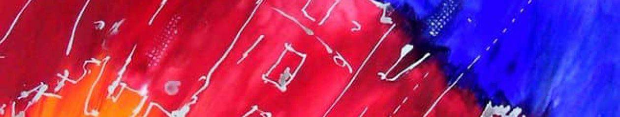
This is all too dark. Maybe it just looks like that on photograph, but still it is kind of missing something that gives depth and perspective 🙂
Originally posted by serola:
Thanks Sami for your comment. 🙂 I was wondering if most people would think it's too dark. There is a lot of raised texture that doesn't show up. The main problem is the photograph of it, I had not intended to post, but use only as a documentation of progress. I'll do some more work on it and get a better photograph.
Originally posted by Blackcalla:
To shoot something like this must be challenging. All the details comes out only when seen the painting with plain eyes.
Originally posted by serola:
Exactly. For one thing you need natural daylight–this makes the PP WB much easier, which is as important with paintings, as in portraiture. And then there's the problem of direction of the light to show up some of the texture. I've had the best results in the summer time, shooting outdoors in the north shade. In the winter time I do it beneath our large front window which faces west, but the sun never gets there till late in the day. This gives good WB with some directionality to the light. 🙂 The photograph above I took in my studio, just as sort of a work progress picture for my records.
The thing still is that I kind of miss three dimensionality on this particular painting. Maybe it has it and it just don't come out in photograph. I mean dimensions made with colors. Maybe making those green and light areas even brighter could do that.
I ran 'auto adjust colors' on IrfanView editor, and first of all it revealed the lovely structure of the paint. So, now I at least got the idea what it really looks like. Then I tried to increase saturation quite generously, to make the lighter areas more colorful. That way it got a glowing feature, which also helped to make the red and green areas look like they are behind the black teared curtain.
A lot of those lighter areas are actually raised, with some of the black paint removed. I'd like to see what you obtained with your pp. Why don't you post it here. 🙂
This morning I actually remembered the old editing trick. So, here's a showcase for you:

I hope it does justice for the original 🙂 All I did is:
– Duplicate layer
– Invert duplicate
– Remove colors for duplicate
– Turn layer mode for 'Soft light' for duplicate
– Gaussian blur 5 for duplicate (to sharpen)
– Merge layers and sharpen some more.
Thanks Sami. This is probably a little closer than my original image is. But, the problem is it has an overall yellow-grayish look to it. I worked on it today, but before I did I took some better photographs of it. This one is the same stage as the original image (above). .
.
Then I did some work on it–refining the center of interest some, and removing some lighter areas that attracted the eye away from the main focal area. By the time I took this image the light was getting pretty strong directionally, so more of the texture shows up.
Notice though that the blacks and grays are truer in color. 🙂
A good photographs makes miracles for the presentation :up: Now the last version i would hang on my wall 🙂 now I see the structure, and it actually does seem to have the 3D quality what I was missing. If you were not that far, I would seriously consider buying that work. i do have a soft spot for darkish art 😀
Well, you'd have to wait till after October anyway–I'm going to enter it in the upcoming ISEA show in Massachusetts, and hoping it gets accepted. May do a little fine tuning on it yet. Entry deadline is the 31st of March. 🙂
I remember doing this kind of drawings at school when I was a kid. First colorful ares were drawn with colorful crayons, then covered with black, and finally lines scratched out with some edge.
But how about if you paint multiple layers on lumpy background and then "sandpaper" the surface? Imagine having layers of paint like here: http://reubenmiller.typepad.com/my_weblog/2007/11/just-paint-it-o.html
EDIT: Oh yes, someone has made something like that already :up:
http://www.neatorama.com/2010/09/24/color-layered-table/
Originally posted by serola:
That's exactly how some of the lines in this painting were emphasized after coating them with black gouache. 🙂 Notice in particular that one line on the lower right extending down from a lighter area. Just lightly sanded off the top of the line. If you try and lift the paint off with water and a brush, invariably I would get more black off than I wanted. 🙂
:doh: Indeed that is exactly what you have done 🙂 Although, I meant really many layers.
Originally posted by serola:
Yes, I've done that, except, I did it with paint layers and then hit the painting with a high pressure stream of water while the paint was still damp. This give random removal of different layers, and sometimes gives very pleasing results, and others nothing worth while. 🙂
I like the painting in the first sight, but still should like to see it closer how it is painted. Very interesting sructures. I did some photographing for own work, but yours are much more complicated. A lot of dark colors. I had the best experience with clouded weather, when the light is flat and used it as a base for further editing. I could imagine inside first a good overall flat light and a light from the side to make the structure of the painting more showing. Maybe a white surface on the side for ligtning up the dark parts. But I will look later on the bigger screen of my desktop, just sitting now behind my mini laptop. Only telling some own experiences 🙂
Originally posted by Blackcalla:
Oh, using water for removal sounds interesting :up: And that made me think of 'blow painting': http://www.education.com/activity/article/Blow_Painting/
Children's activities. 🙂
But could be a technique to do some serious art 🙂 Imagine a huge canvas and then use http://en.wikipedia.org/wiki/Leaf_blower
😆
I have a fairly big air compressor with a small nozzle on it that I've blown paint around in the past. Haven't used it much in the last year or so. 🙂
Well, a leaf blower is probably better for a "land art" 😆
Yeah, all that would do is blow a lot of dirt on the painting which is not what you want most of the time. 🙂 But, it's something I might try messing around with this summer when I'm painting outside. 🙂
Merle, you did great work rendering the image more clearly! :yes: Not sure if I love this one. It doesn't seem finished to me – and don't ask me how I came to that judgement, it's more a feeling than anything else! Maybe it's the geometry, it's just a little bit square and boxed-in to my eye.
Thanks Richard. Yes, I know what you mean about something just doesn't look right. Part of the problem I think is the right lower quadrant seems kind of empty–and I'm working on that so will have a new view to post in a day or two. 🙂
Originally posted by Blackcalla:
Cool! I look forward to seeing it.
So do I