Acrylic Pouring


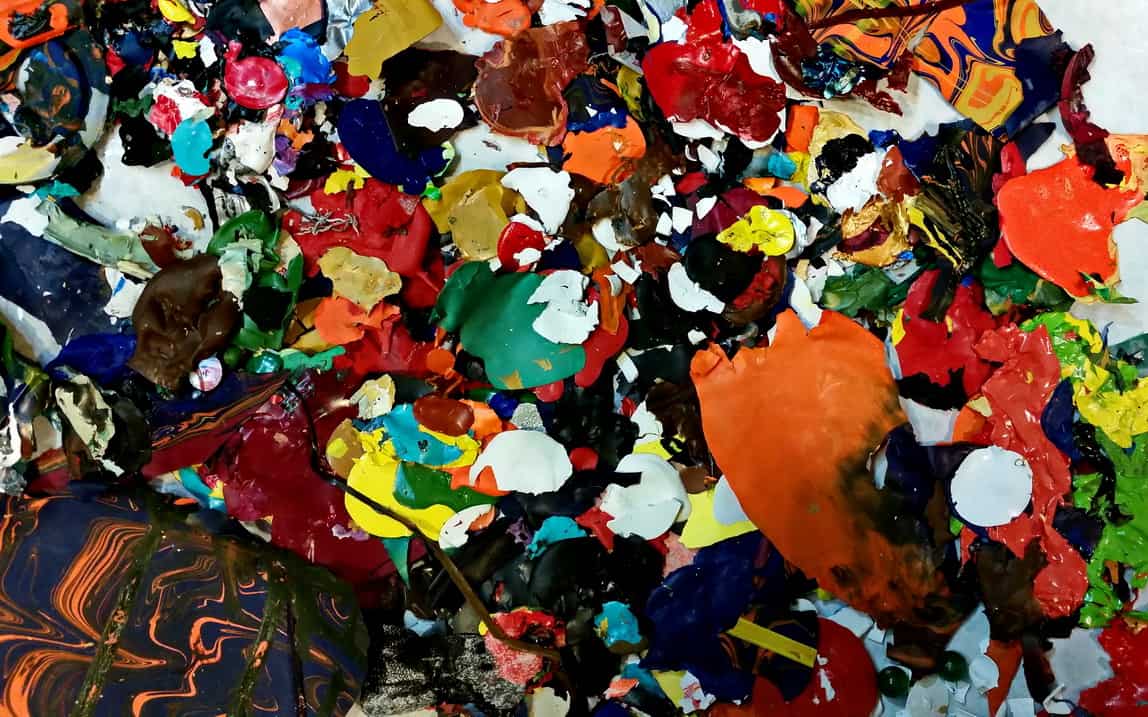
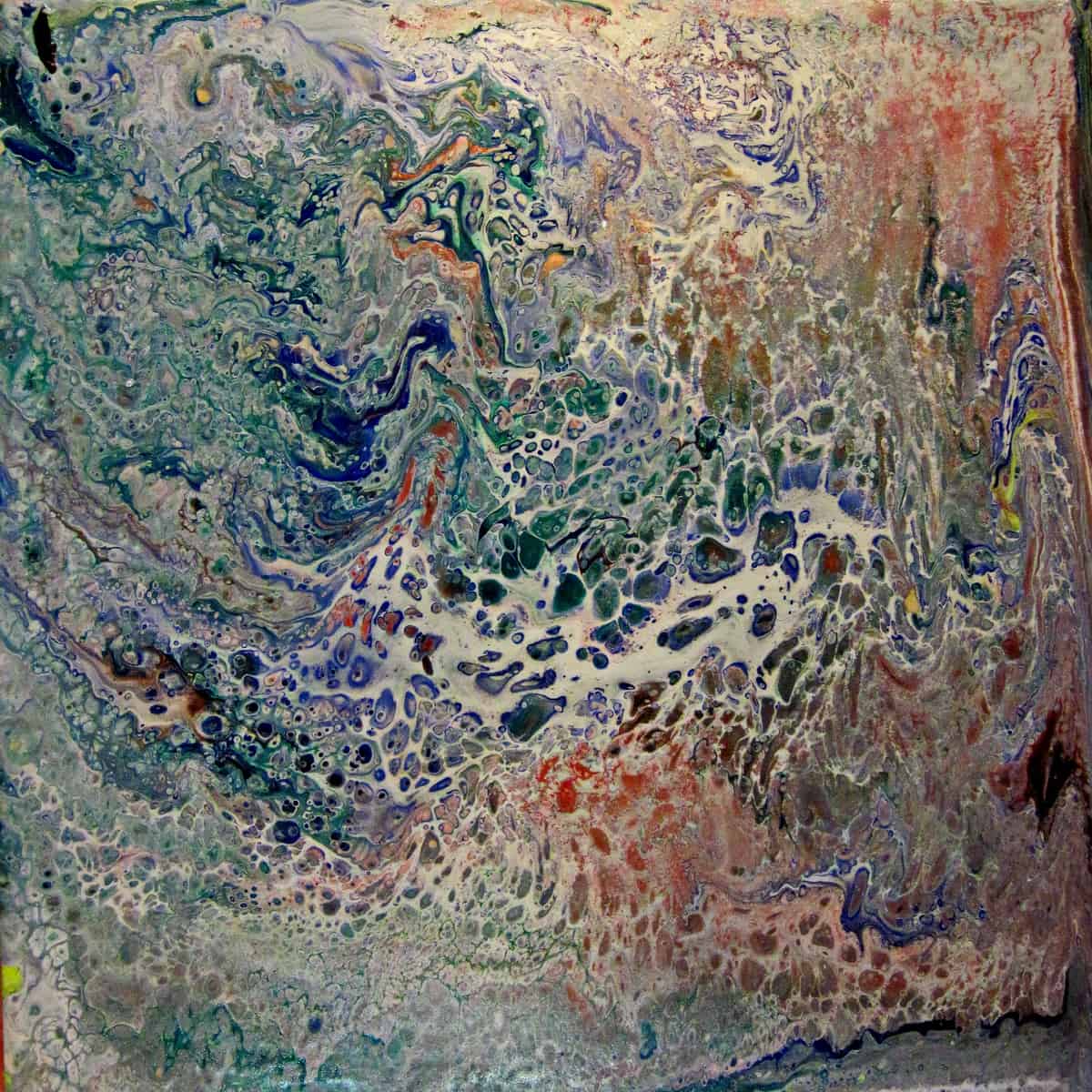
This seems to be the newest fad in acrylic painting. It can produce some beautiful pieces. It’s easy to do on a small scale, but very difficult on larger canvases. I did this using acrylic paint and Paint Easy to thin the paint, and silicone spray. I have not seen any mention of using Paint Easy to thin the paint, but it seemed to work well. It’s made by Wagner Spray Tech Corp, and can be purchased at Walmart stores. Another diluent is Floetrol by Flood, which is made by PPG. I just purchased some from Amazon, but I think Home Depot sells it also.

These are 8″ tiles (doesn’t matter what color they are). I then varnished a couple coats with Golden Polymer Varnish with UVLS. I like this varnish–produces no brush strokes and is an archival finish that can be removed and replaced if dirty after years of display. One piece of advice–photograph them before varnishing them, particularly if you use a glossy varnish. It’s very difficult to get rid of the shiny highlights from your photograph if it was taken after varnishing.

This is a very unpredictable way of doing paintings, and I’d like to find a way to make better designed paintings with it. I’ll keep working on it. Check out the other couple other images in my gallery of paintings also.

PART III: LIGHTING AND POST PROCESSING

Lighting Requirements
The best lighting is bright clouds outdoors.I often do my photography in front of a large West Facing window which gives about a 45 deg angle to the light. I avoid taking any picture when there is direct sunlight falling on the floor where I do the photography. This will give you the truest white balance and best likeness of your art work with the least requirement for post processing. When photographing indoors or in bright sunlight.specular highlights are sometimes difficult to avoid. If you are using artificial lights indoors, have the lights on either side of the art work and at a 45 degree angle to the painting. (See drawing in Part I) This makes the highlighting problem much less.

If you are photographing a 3-D piece some shadow is desirable–it gives shape and form to the piece. Do not use on-camera flash for any art photography. It is usually unnecessary and gives horrible, flat, frontal lighting and often times a lot of specular highlights.

Post Processing for best likeness.
If you have had adequate lighting, so that you have a well exposed image with normal appearing white balance your work is almost done. You will need to adjust the size of the image to fit the requirements of the venue it’s going to be entered. Above all make sure it is straight and no frame or background is showing and that it looks like the original art work. If the image looks blurry, retake the photo of your piece. There is no fix for blurriness.

Questions–please open a discussion in the Comments.

PART II – PHOTOGRAPHING YOUR ARTWORK

First–A a couple pictures of the problem of photographing your image after framing in glass or Plexiglas.

Here’s a photo of a painting after framing.

Photographed AFTER Framing

Best results with post processing on framed first image.

And Here’s before framing. What a difference.

Camera Requirements and Basic Settings
Most newer cameras, including cell phone cameras do a great job with recording your image if you have heeded the preliminary requirements listed in Part I. If your venue requires images suitable for publishing in a catalog a phone camera usually produces images which are a little on the small side. The image file after processing needs to be 0.8 to 1.5 MB in size. Having a camera with an adjustable shutter and lens aperture will make the process much easier in every step, and give you sufficient size for publication.

You will need some means to hold the camera steady with the sensor plane parallel to the painting surface. If you have good lighting your shutter speed will be fast enough to hand hold. There is no need for extra depth of field, so use an aperture that’s wide open, and set your camera on Aperture Priority. Set the ISO no higher than 400. If you are photographing several paintings, mounting your camera on a tripod will help speed things up.

If your piece is mostly white or light colors, you may need to increase your exposure a little if possible, as your camera’s exposure is based on 18% gray, which is darker than light colored paintings and lighter than dark color paintings. If the image is too dark and no way to set the exposure, it can be corrected on your computer later. Also for overexposed images with dark or black pieces you may need to decrease the exposure if possible.

When you photograph 3-D pieces you need to make sure your background is bare. Hanging a black or white cloth so that it covers the entire field of view of your camera is an absolute necessity.

Next time I’ll wind this up with a couple notes about post-processing.

PHOTOGRAPHING YOUR ARTWORK

I want devote a couple posts to talking about photographing your art work. In this digital age, most organizations require digital images for entry into juried and non-juried shows. Also, it’s a must for documenting your work, should it ever be sold, donated or given away or stolen.

Part I
Important Points in the Process of preparing an image for juried entry:

1. Read the Instructions from the venue carefully. You have to know the requirements of organization or web site. – Most will specify the size, the digital format required (most use JPG) and naming of the file. All of these requirements will need to be met using some software on your computer. Common free programs include, Irfanview, Xnview and GIMP and Picassa. (However I don’t recommend Picassa because it strips the EXIF information which may be required for some entries.) Other programs that entail some expense in order of increasing complexity (and expense) are, Photoshop Elements, Corel Paint Shop Pro, ACD Systems, Serif PhotoPlus, Lightroom and Photoshop Creative Cloud. All of these I think are available in MAC and Linux versions also.

2. Record your image before it is framed. I can’t stress this enough. It’s almost impossible to avoid reflections, frame edges and get correct color balance if the painting is framed. Three-D art work has special needs for even lighting with some shadows. (See suggestions under #4 below.) A good accurate image will help your entry.

3. Make sure your camera looks at your painting exactly square on. (See my drawing–notice the plane of the sensor is exactly parallel to the plane of the painting.) The more accurate you do this now in the camera the easier and quicker it will be editing it later in the computer.

4. Lighting is important for 2-D work as well, most importantly so you don’t get specular highlights from a shiny painting). I use natural daylight as much as possible–either in front of a large window, or outside in the open shade. Cloudy days are especially good because the light is more even, and you don’t have to worry about shadows and a slight blue tint you will get in open shade on a sunny day. Make sure there are no shadows on your work–the results of which on your work are almost impossible to correct in free programs. With 3-d art, some shadows are advantageous in defining the shape and contours of the piece, so some directional light is necessary.

In the next post I’ll mention a bit about cameras and settings.

Free Slide Contact Printing Frame

Cleaning out my old photographic stuff, and found these two printing frames, made by Ilford. They have hardly been used.  I hate to throw them away, but If I can’t find a taker in the next few months I’ll have to. They originally cost about $50 20 years ago. All you have to pay now is postage.

I’m sure they are not available in stores anymore.  But in their time they were the perfect solution for creating contact sheets of 2×2 slides. Two trays were printed, which were offset from each other by the width of the slides, so the slides could be printed 35 to an 8×10 sheet.  If you are interested call or e-mail. (269-330-9808 or mplagge1901@earthlink.net)

Paint-In on Mackinac Island

A group of artists meet annually–recently on Mackinac Island for a week of painting and networking. Great to see friends again this past week.  The weather was typical for this time of the year. We did have a couple days of clouds and rain one day, but that just allows for more painting time.  The day tourists are increasing now, and it’s so interesting watching them. One of the ladies in our group  does this–goes out and sketches people and street scenes.  There is a wide variety of work displayed amongst all the artists in the group.  It’s held at  the Murray Hotel. It  is a great venue for this–close to everything and a beautiful studio room downstairs, and painting available 24 hrs a day if you want.

Here are a few photos of our week as well as a couple of paintings I worked on that are finally coming to fruition. They have lain in my file drawer for at least a couple years. Click on image to open the rest in this gallery.

Another Finish

I’ve been trying to reduce the number of started paintings that have good potential, and this is one that I started at a summer workshop. The composition just didn’t seem right. So I added another dot of orange paint and cropped the length a little.  I like it now. 

It was done with three colors–two analogous and one opposite.  A dark and light blue along with the orange, all sing together.

I notice some deterioration of the image from rubbing against other papers in the flat file. These images need a varnish protection before storing to prevent this from happening. (See Post of October 3, 2012 for initial photo–) Continue reading Another Finish

Finished Mixed Media Collage Piece

After a little rearranging and getting all the pieces tacked down, I put a heavy coat of varnish (satin) on it, it’s ready for display. I’ve called it “Lord Christopher Darnsworthington, VIII.  Google didn’t have any name like that listed, and it’s sort of whimsical, but appropriate for this fellow dressed in all his finery.

The list of materials used is quite long too. Most are fluid acrylic paint and various types of plastic, cotton, paper and cake decorations.   Wish him well on his journey!  🙂

Collector in Chief

I am a collector–can’t throw anything away. Even blobs of dry paint that I’ve peeled off the bottom of a plastic cup . Even cracked pieces of watercolor paint occasionally come in handy in painting. But they especially come in handy when doing mixed media collage. A small dot of red paint makes a great eye, and stringy pieces make hair, etc.  Gray paints make great scales. Most of them after they are thoroughly cured can be easily stored in a small container. They appear to stick together, but easily come apart.

Here’s a part of my collection of acrylic paints. Don’t hesitate to save them. Leave they out in the air separated for a week or so, and then they will be fully cured and will easily peel apart when stored together.